Snowfall Season 2 branding graphics
Client: Fox
Producer: Shogo Akagawa
Producer/Editor: Ayumi Kawamura
Art director/designer: Victor Camacho
Working along briefs, has been one of the most important things always in my career. It ensures strategy works, and the message delivers the right content to the right people. In this case, we had SnowFall Season 2. Along with FOX talented marketing department, we decided to include 80s Los Angeles vibe and culture. Due to the violent nature of the show, we thought it would be better to sweeten the look and feel of the show.
I love working with Mindmaps, it allows me to flow my creativity, therefore I can grasp ideas that are hard to imagine otherwise. Please click on the link to see what I did for this project. If you have any questions about how I use mindmaps in my workflow, please send me a message, I am more than happy to share it.
Please watch Snowfall mindmap here
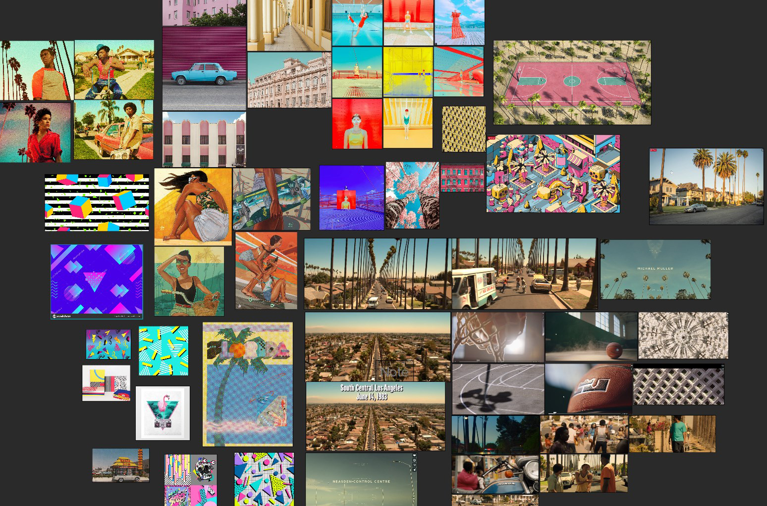
For the art direction, I searched iconography of the 80s,from Davie Bowie to the 80s hiphop culture. I wanted to express the colorful color correction of the show into the graphics. At the same time, I had to reference icons from the show that are retained in viewers memory. After many tests, we decided to stick with the idea of the neighbourhood and the palms. I flipped the reality and invert colors to create a twist on how we percieve objects.
This is a screenshot of the moodboard I built and the references I thought it could represent the show.
Moodboard
Shows branding, the same as companies requires consistency. I developed the style across all graphics for the show.
Here all the graphics I developed

